In addition to data sets, taylor also includes a few helper functions for easily making plots created with ggplot2 have a Taylor Swift theme. For this vignette, I’m assuming you are already familiar with ggplot2 and can make basic plots.
Once you have a ggplot created, you can add album-themed color
palettes to your plots using the family of scale_taylor
functions:
- Discrete scales:
- Continuous scales
- Binned scales
Discrete scales
First, let’s make a bar graph showing the valence of each song on evermore.
library(taylor)
library(ggplot2)
library(dplyr)

evermore <- taylor_album_songs |>
  filter(album_name == "evermore") |>
  mutate(track_name = factor(track_name, levels = track_name))

p <- ggplot(evermore, aes(x = valence, y = track_name, fill = track_name)) +
  geom_col(show.legend = FALSE) +
  expand_limits(x = c(0, 1)) +
  labs(y = NULL) +
  theme_minimal()
p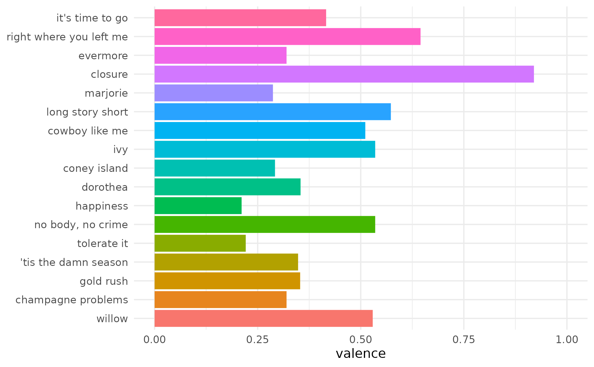
We can then add some evermore-inspired colors using
scale_fill_taylor_d().
p + scale_fill_taylor_d(album = "evermore")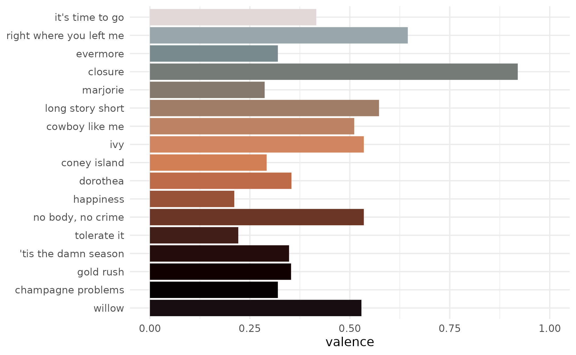
The album argument can be changed to use a different
Taylor-inspired palette. For example, we can switch to Speak
Now using album = "Speak Now".
p + scale_fill_taylor_d(album = "Speak Now")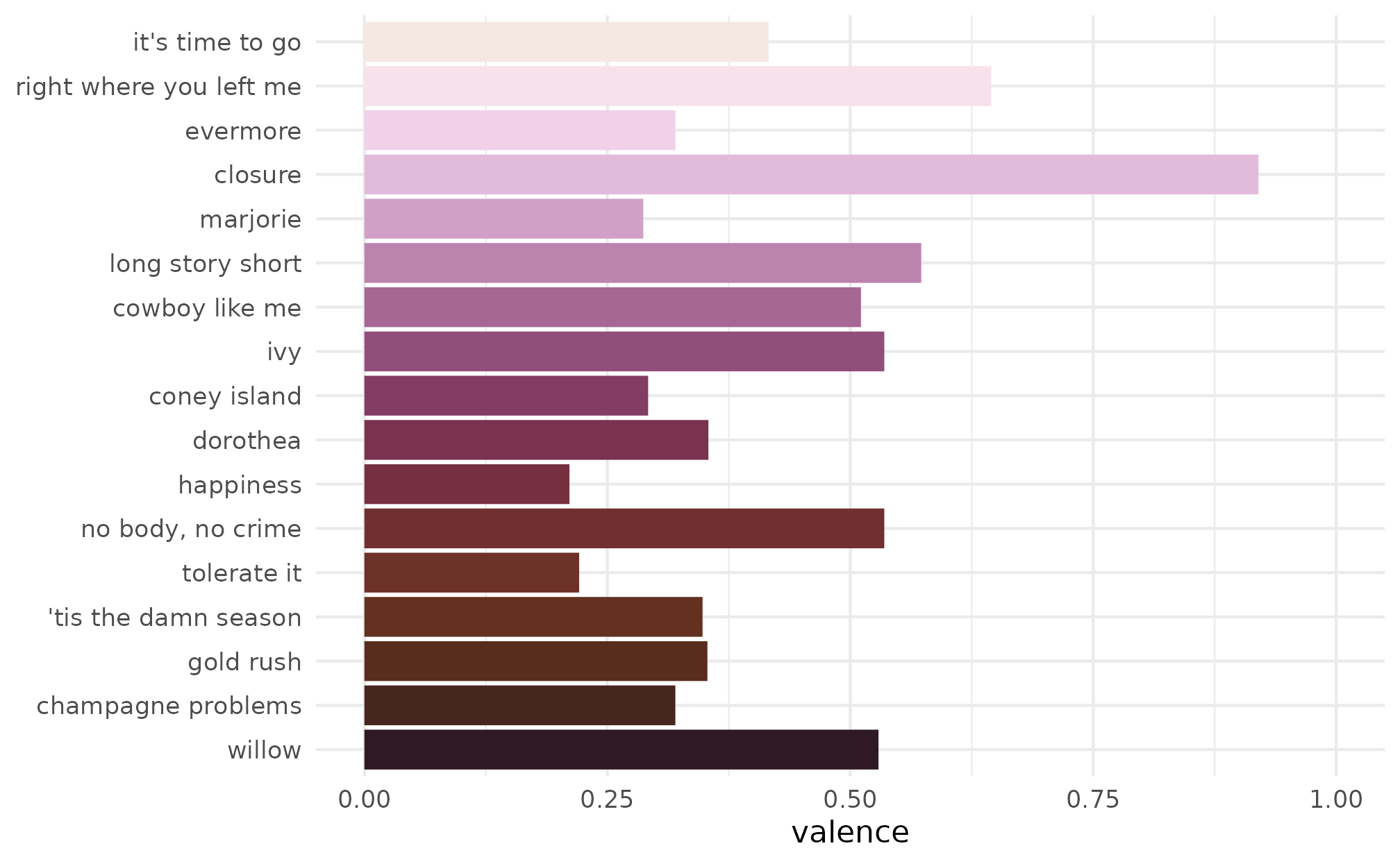
We can also use these functions for non-Taylor Swift data. For
example, here we use scale_color_taylor_d() to plot some
data about ?penguins.
ggplot(penguins, aes(x = bill_len, y = bill_dep)) +
  geom_point(aes(shape = species, color = species), size = 3) +
  scale_color_taylor_d(album = "Lover") +
  theme_minimal()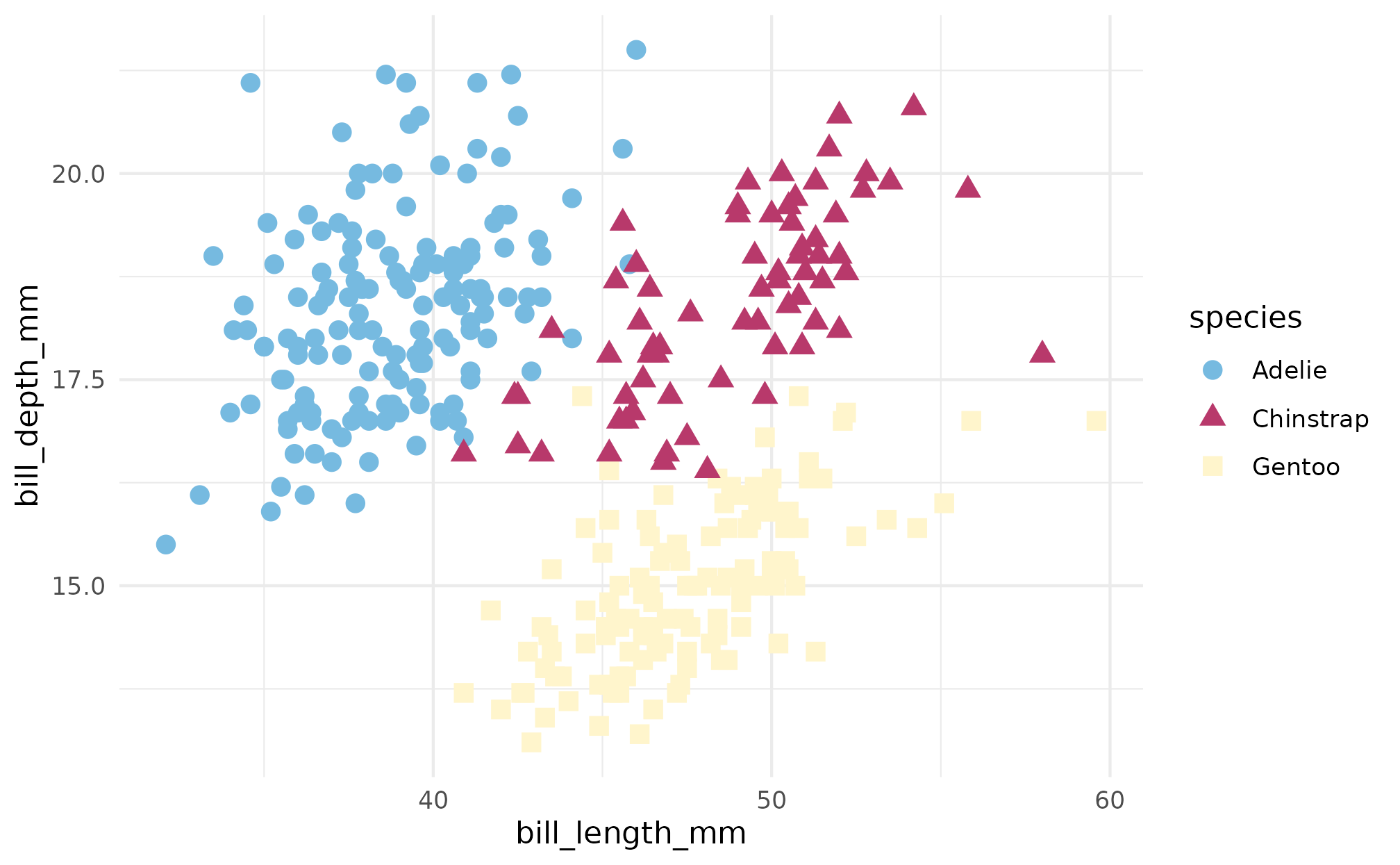
Continuous and binned scales
When using a continuous scale, values are interpolated between the colors defined in each palette. The Fearless (Taylor’s Version) palette is a particularly good use case for this. To illustrate, we’ll use the classic example included in the ggplot2 package of the eruptions of the Old Faithful geyser and the duration of the eruptions.
p <- ggplot(faithfuld, aes(waiting, eruptions, fill = density)) +
  geom_tile() +
  theme_minimal()

p + scale_fill_taylor_c(album = "Fearless (Taylor's Version)")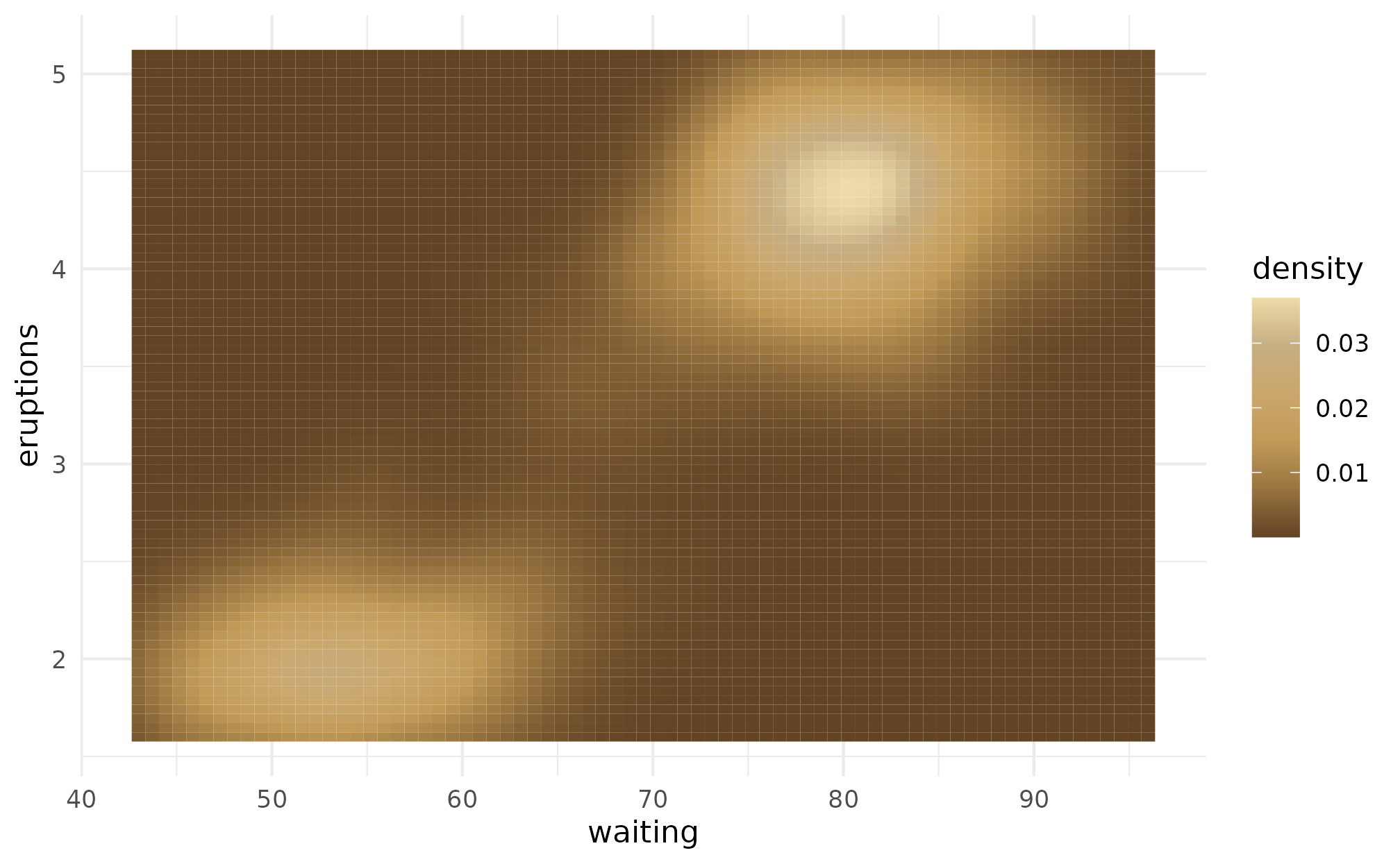
Similarly, both the reputation and folklore palettes work great for gray scale images.
p + scale_fill_taylor_c(album = "reputation")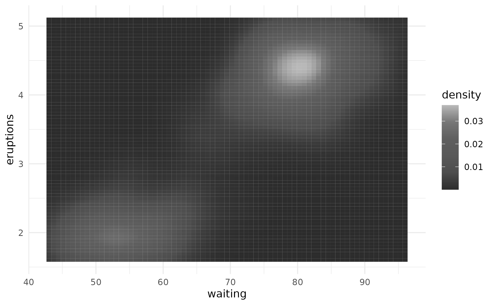
p + scale_fill_taylor_c(album = "folklore")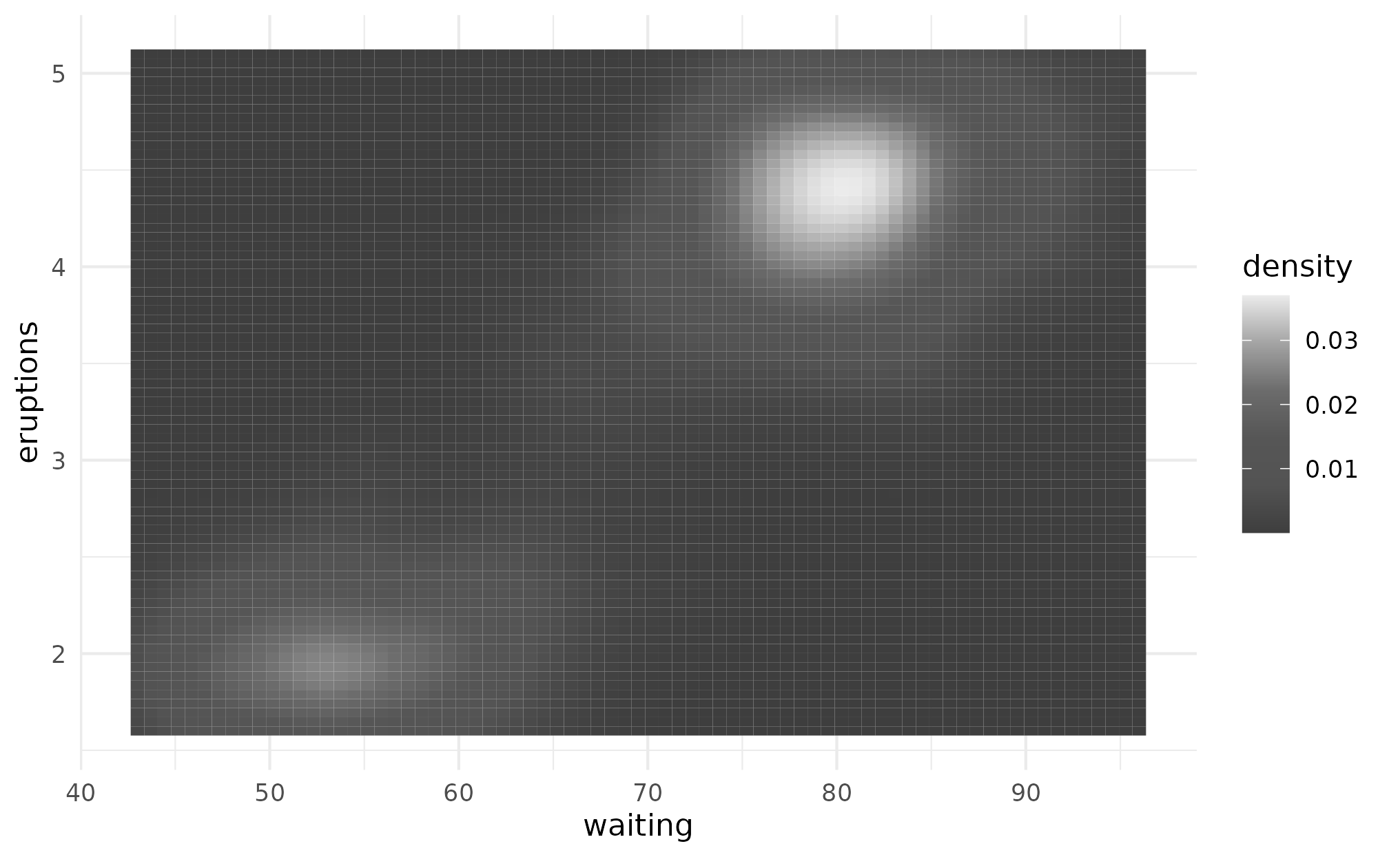
Just like with other ggplot2 scales, we can also use the
_b variants to create a binned color scale.
p + scale_fill_taylor_b(album = "evermore")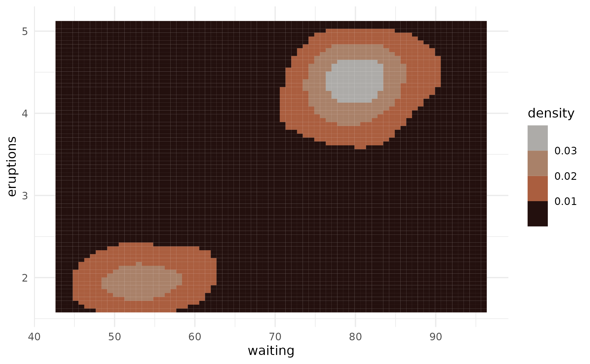
Album scales
Finally, there is an album scale that can be used when plotting data
from multiple albums. Take for example the Metacritic
ratings of Taylor’s albums, stored in ?taylor_albums.
taylor_albums
#> # A tibble: 18 × 5
#>    album_name                    ep    album_release metacritic_score user_score
#>    <chr>                         <lgl> <date>                   <int>      <dbl>
#>  1 Taylor Swift                  FALSE 2006-10-24                  67        8.4
#>  2 The Taylor Swift Holiday Col… TRUE  2007-10-14                  NA       NA
#>  3 Beautiful Eyes                TRUE  2008-07-15                  NA       NA
#>  4 Fearless                      FALSE 2008-11-11                  73        8.4
#>  5 Speak Now                     FALSE 2010-10-25                  77        8.6
#>  6 Red                           FALSE 2012-10-22                  77        8.6
#>  7 1989                          FALSE 2014-10-27                  76        8.3
#>  8 reputation                    FALSE 2017-11-10                  71        8.3
#>  9 Lover                         FALSE 2019-08-23                  79        8.4
#> 10 folklore                      FALSE 2020-07-24                  88        9
#> 11 evermore                      FALSE 2020-12-11                  85        8.9
#> 12 Fearless (Taylor's Version)   FALSE 2021-04-09                  82        8.9
#> 13 Red (Taylor's Version)        FALSE 2021-11-12                  91        8.9
#> 14 Midnights                     FALSE 2022-10-21                  85        8.3
#> 15 Speak Now (Taylor's Version)  FALSE 2023-07-07                  81        9.2
#> 16 1989 (Taylor's Version)       FALSE 2023-10-27                  90       NA
#> 17 THE TORTURED POETS DEPARTMENT FALSE 2024-04-19                  76       NA
#> 18 The Life of a Showgirl        FALSE 2025-10-03                  69       NA
Let’s create a bar graph showing the rating of each album. We’ll
first make the album name a factor variable. A convenience variable,
?album_levels, is included in the package that will let us
easily order the factor by album release date. We’ll give each bar its
own color to add some pizzazz to the plot.
metacritic <- taylor_albums |>
  filter(!is.na(metacritic_score)) |>
  mutate(album_name = factor(album_name, levels = album_levels))

ggplot(metacritic, aes(x = metacritic_score, y = album_name)) +
  geom_col(aes(fill = album_name), show.legend = FALSE) +
  labs(x = "Metacritic Rating", y = NULL) +
  theme_minimal()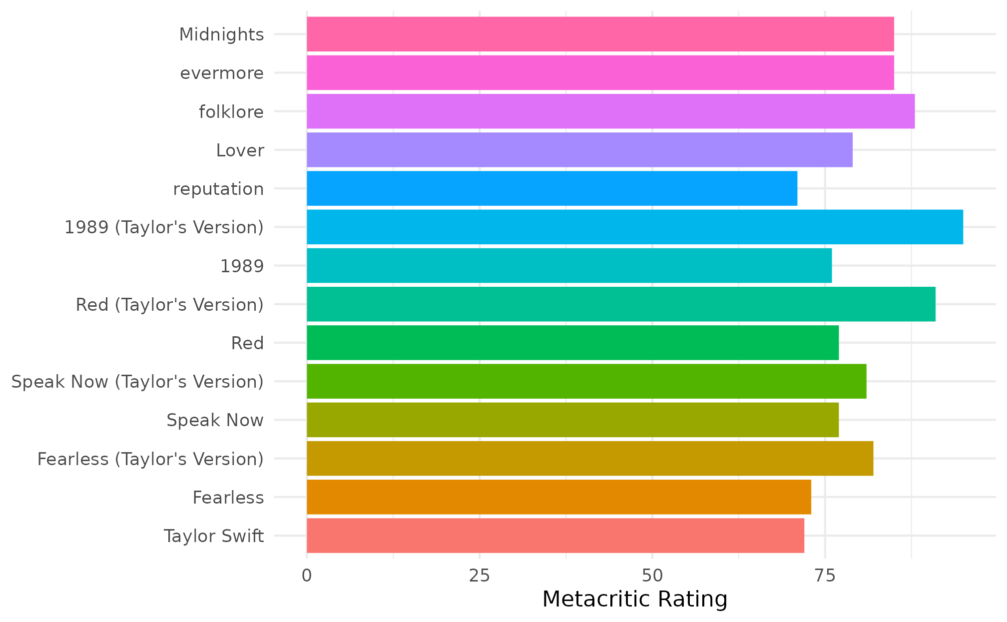
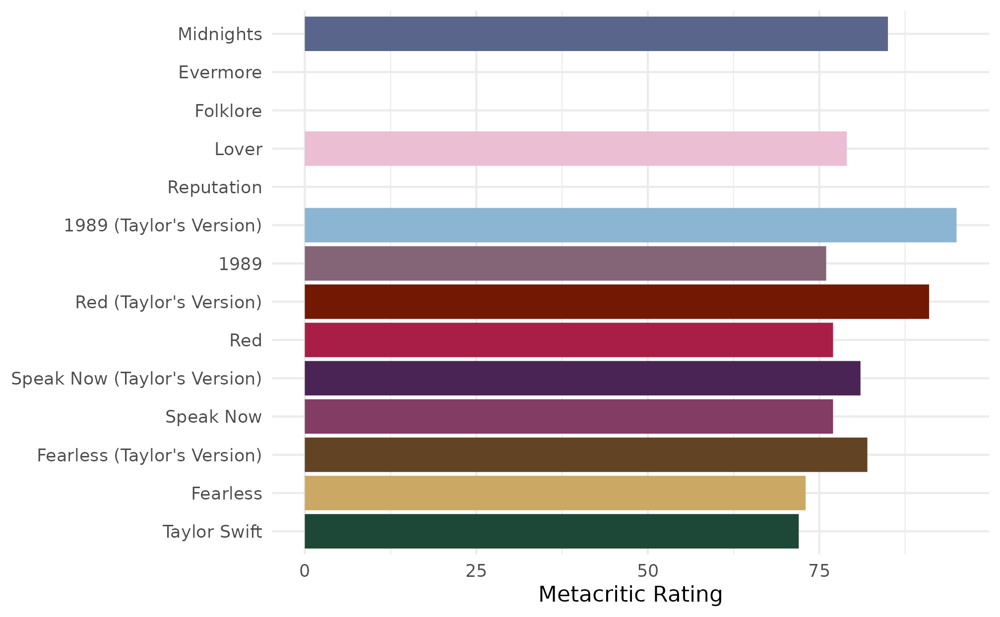
This is nice, but wouldn’t it be better if each color was related to
the album? Enter scale_fill_albums()!
ggplot(metacritic, aes(x = metacritic_score, y = album_name)) +
  geom_col(aes(fill = album_name), show.legend = FALSE) +
  scale_fill_albums() +
  labs(x = "Metacritic Rating", y = NULL) +
  theme_minimal()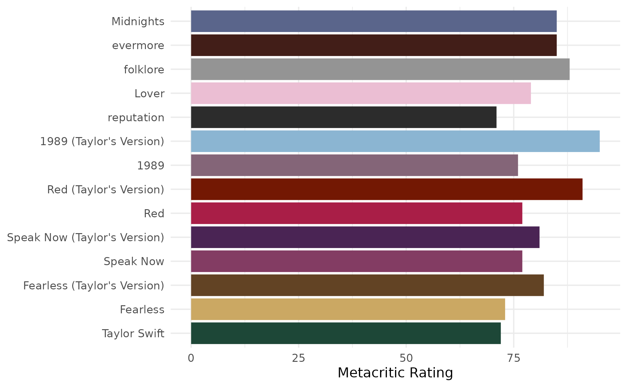
The scale_fill_albums() and
scale_color_albums() functions automatically assign color
based on the album name. These are wrappers around
ggplot2::scale_fill_manual() and
ggplot2::scale_color_manual(), respectively. This means
that the colors will still be assigned correctly, even if the ordering
of the albums changes, or not all levels are present.
set.seed(121389)
rand_critic <- metacritic |>
  slice_sample(n = 5) |>
  mutate(album_name = factor(album_name, levels = sample(album_name, size = 5)))

ggplot(rand_critic, aes(x = metacritic_score, y = album_name)) +
  geom_col(aes(fill = album_name), show.legend = FALSE) +
  scale_fill_albums() +
  labs(x = "Metacritic Rating", y = NULL) +
  theme_minimal()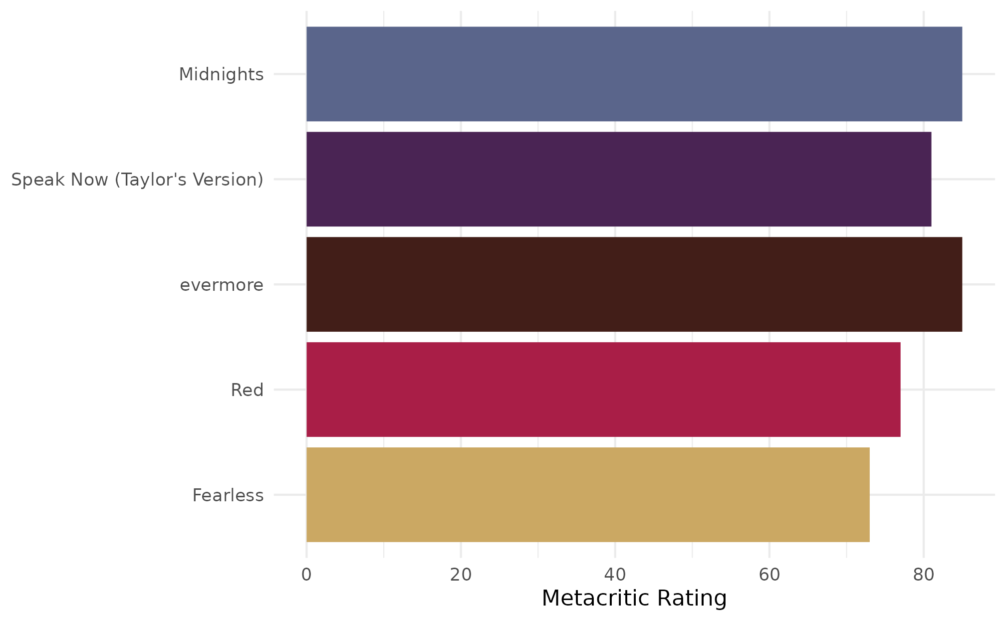
We’ve also done our best to make the album names resistant to different formatting decisions. For example, using all upper case or title case will still find the correct color for the album. We also support common alternatives for album names such as Debut for Taylor Swift, TTPD for the THE TORTURED POETS DEPARTMENT, and TV as a stand-in for Taylor’s Version.
alt_names <- metacritic |>
  mutate(
    album_name = case_when(
      album_name == "Taylor Swift" ~ "Debut",
      album_name == "folklore" ~ "FOLKLORE",
      album_name == "Red (Taylor's Version)" ~ "Red TV",
      album_name == "THE TORTURED POETS DEPARTMENT" ~ "TTPD",
      album_name == "The Life of a Showgirl" ~ "The Life Of A Showgirl",
      .default = album_name
    ),
    album_name = factor(album_name, levels = rev(album_name))
  )

ggplot(alt_names, aes(x = metacritic_score, y = album_name)) +
  geom_col(aes(fill = album_name), show.legend = FALSE) +
  scale_fill_albums() +
  labs(x = "Metacritic Rating", y = NULL) +
  theme_minimal()